For my final project to conclude my Masters Degree, I am creating a website to portray the knowledge I have gained, back to the general public. My target audience focuses on Christian youth workers, but can also be use by parents and young people, who are interested in knowing about the risks and benefits if games, and how they can be used for positive purposes.
The first problem I came across was a simple but enduring one. What colour scheme to use. I am aware of the impacts of colour, and endeavoured to use colours to make the site look professional, but not plain. I came to a point where I decided to choose a colour scheme, and to stick with it until I had some content ready, and this was the most important aspect.
Images of my initial design can be seen below.

This image shows the Home page, I wrote a brief explanation about what the website is for, as well as the content that would be on the site. The section of recent updates is one I created myself, so would have to update it each time I added to the site.

If a visitor to the site where to click on the game reviews tab, they would find this page. This page would have explained what the reviews on each game format would be about. The icons were created to visually show which game format is which, and when the mouse is hovered over them, the image inverts to show it can be clicked on.

This is the layout for the resources page. Again, I added a number of icons to make it visually obvious to the player what each game is about. I added a download icon for these resources, intending to upload them for people to download and use as they please.

The images on this page were used entirely for place-holder purposes. I also used the PEGI rating system icons to allow users to easily recognise the content and rating of each game. If a game did not contain certain material, then those icons would be faded out. Both the resources and review pages had a layout that was created by myself, meaning I would need to add another section to each page, should I add another review/resource, and repeat this for any I add in the future. A similar layout was also used for the Board game, Card game and Physical game pages.

I added a contact page, to allow visitors to send me a message with any questions they may have about the site. I was careful with the wording on this page. I did not was to make it seem like I was just running a blog, and wanted it to seem professional, so I didn't write in the first person. I also didn't mention 'We', as this would give the impression that there are multiple people running the site.
This layout for the website worked well in the beginning, but I soon can across rather a large issue in the design. If I were to continue with this initial layout, I would need to make a web page for each individual resource and game review that I add to the site. I would then need to link these pages to the numerous icons, images, titles and text on the site, to allow users to easily navigate to specific pages. This would result in a confusing and complicated web of links, that already exists in the typical blog. I therefore turned the main body of the website into a Wix blog, making it easier for myself to add content to the site. A blog is also something's that internet users can be particularly familiar with, so navigation would be even smoother.
The following images show the second layout of the site.

The new layout of the homepage contained much more information, giving users a better understanding of what the site was created for, and what the content of the site is about. There are also links that take a viewer straight to the block, making it quicker for them to access information, without having to navigate to the blog themselves. Images are also displayed of featured posts; blog posts that I have labeled as featured, which are posts that are particularly important or relevant to the site. I have also broken up the text into smaller sections, making it easier for viewers to read.

The Wix blog made things a lot easier, and I was able to personalise the colours and the layout to fit with the theme and scheme of the website. I also added a number of tags, and categories to make it easier for viewers to find the information they are looking for.

The contact page remained the same, apart from the colour scheme.
This second iteration of my website has dramatically reduced the number of pages in the site, condensing the menu bar down to three tabs, with no drop-down lists from the menu. This much simpler setup makes it much easier for users to navigate the website, and for myself to navigate it too. Using the Wix blog feature also allows me to add posts to my blog from my mobile, meaning I can add to the site on the go.
Alongside my website, I planned to create a complete playable game. I soon however discovered that creating a complete game is a lot of work for one person to do, and there was not enough time to do so. I therefore decided to create a pitch document to display the game concept. I later discovered that in order to better display the pitch document, rather than having it printed and ring bound, I could add it to my website. This in itself would save a lot of time and hassle with ensuring everything was arranged on the pages correctly to nothing was cut during printing, as well as colour issues, double page layouts, etc.
So I added the pitch document to my website, adding a new menu tab for potential games. This new tab would have a drop down list that would list any other potential games I add in the future, and since such games take time to concept and create, it is unlikely there will be a large list there, that will negatively impact the visuals of the site.
Images of the page showing the game concept can be seen below.

This initial image shows the title of the game, and instantly shows viewers what the art style for the game is going to be like. It also gives a brief explanation as to what the game is going to be about. When creating this particular part of the page, I initially attempted to layer the images on the site itself. However, I soon found that it was particularly difficult to do, and so I simply placed a complete image in the background, and added the text on top.
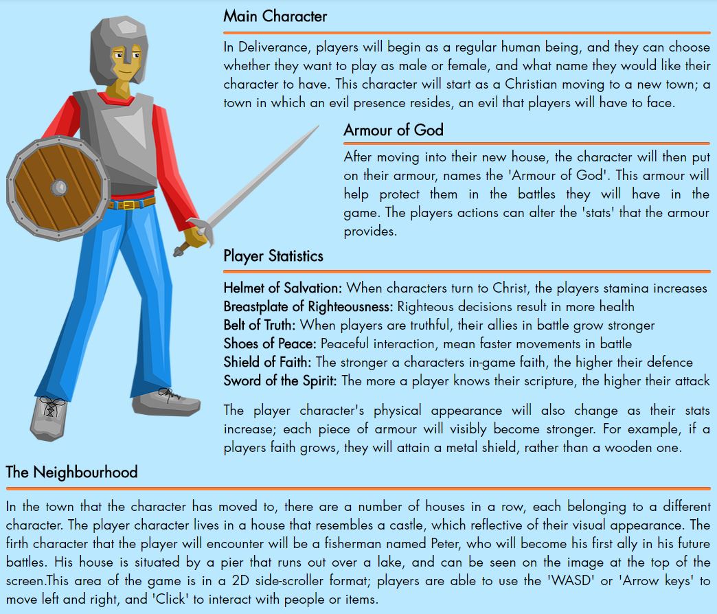
This part of the page shows information on the main character of the game, including the armour that he/she wears, the stats the armour provides, and the neighbourhood in which the character now lives. This page proved a slight challenge to ensure the text did not interfere with the image.

This image simply shows the house in which the main character lives.

This section displays information on the battles, homes and the main mechanic of the game; seeing into the spiritual realm.


These two images display the two versions of the room. The upper image shows how the room looks normally, and the lower image shows what the image looks like in the spiritual realm. Anyone who views this page is able to click on the upper image as it is displayed, and it will instantly toggle to the view of the spiritual realm. I was able to use this feature having learnt about it from the use of icons in my previous designs. It is an inventive way to use the feature, and also engages the viewer.
Displaying the concept on the site not only makes it easier on myself, but it also present my ideas to the public. If people are interested in the concept, then they are able to contact me if they so desire. It also ensures that at my MA show, all of my work is compact and well presentable, with no lonesome pitch document on display.
0 comments:
Post a Comment